Odd Correlations
December 7th, 2020

A few years ago I discovered a fun website Spurious Correlations. When two variables are highly correlated (negatively or positively), and if their correlation doesn't seem to make any sense, that's when we call it spurious.
I started working on this post a few months ago, and quite frankly collecting data and finding patterns was frustrating. There are a lot more data sources that I'd like to explore, so I'm planning on collecting more data over time and expanding this post. For now, I'll share some exhibits that I found interesting.
For the purpose of this post, I compiled a dataset with over 1,600 of columns from a variety of sources including the World Bank, Federal Reserve Bank of St. Louis, EIA, FBI, Wikipedia, and a few others (full list is below).
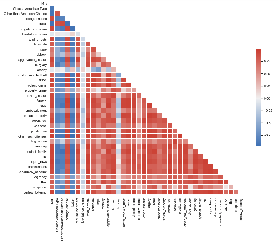
Here are a few interesting spurious relationships I found (in case you don't feel like scrolling down). Dairy consumption in the US seems to correlate with a lot of not so good things including increased CO2 emissions in certain countries. While I can buy this trend (not the magnitude of the correlation coefficient), it's also correlated with different types of crimes in the US with milk, cottage cheese and regular ice cream being the worst offenders. Butter and cheese consumption, on the other hand, are negatively correlated with various types of crime in the US. Should American people increase butter and cheese consumption to keep crime at bay? We would need to do a different analysis to study any potential causal relationship.
You can find my Jupyter notebook Here.
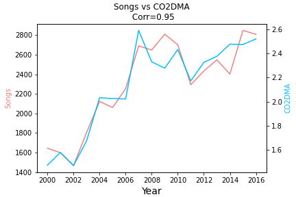
# of Songs by the year in which they were written, first performed, published, recorded, or released vs CO2 Emissions (metric tons per capita) in Dominica
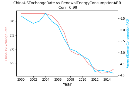
China/US Foreign Ecchange Rate vs Renewable Electricity Output (as % of Total Electricity Output) in Arab World
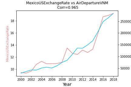
Mexico/US Foreign Exchange Rate vs Air Transport, Registered Carrier Departures in Vietnam
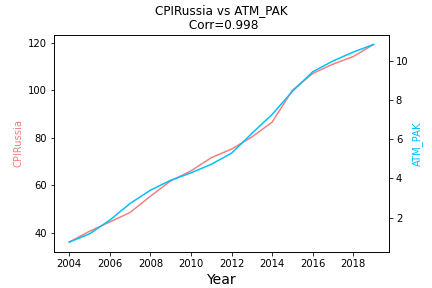
Consumer Price Index (All Items) in Russia vs # of ATMs per 100,000 adults in Pakistan
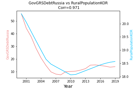
Government Gross Debt in Russia (% of GDP, Not Seasonally Adjusted) vs Rural Population in South Korea (% of Total Population) in South Korea
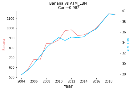
Banana Price vs # of ATMs per 100,000 adults in Lebanon
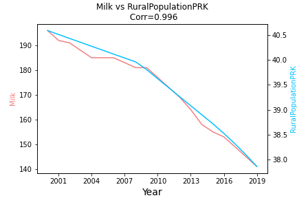
US Milk Consumption vs Rural Population (as % of Total Population) in North Korea
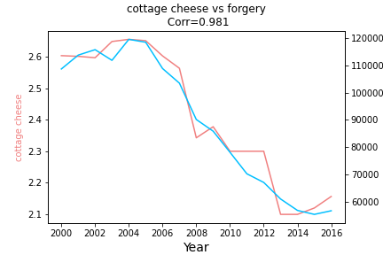
Cottage Cheese Consumption in the US vs US Forgery Crime
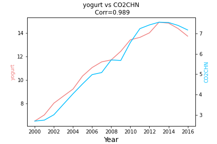
US Yogurt Consumption vs CO2 in China
# of Unmanned Space Launches vs # of ATMs per 100,000 adults in Afghanistan

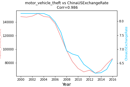
US Motor Vehicle Theft vs China/US Foreign Exchange Rate
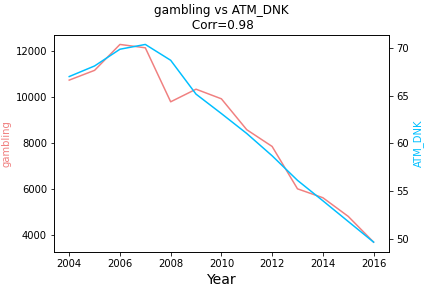
US Gambling Crimes vs # of ATMs per 100,000 adults in Denmark
Here you can explore other series (sorry no support for Internet Explorer). You can view JS code that powers this chart Here
Charts may not look exactly as the ones above due to different default y-axis ranges in Matplotlib (Python) and Google Charts (JavaScript)
Here is a full list of data sources I used
- Number of Songs by Year
- The World Bank
- US Annual Unemployment, GDP, and Inflation Data
- Space Launches
- Historical Oil Prices
- EIA data
- USDA Dairy Consumption Data
- US Crime Data
- Federal Reserve Bank of St. Louis (Exchange Rates, Commodity Prices, Russian Time Series)
- Historical Crude Oil Prices
- Uranium Marketing Annual Report
- US Annual Coal Report
- Temperature Information